Why AI Art Prints Look Dull or Dark (RGB vs CMYK Fix + Free Checker)
Did your Midjourney or AI shirt print come out dull and muddy? See why neon RGB screen colors shift in CMYK ink, and test your file free before printing.
On this page
You make an image that glows: electric blue, hot pink, a green that looks plugged into the wall. You order it on a poster or a shirt. What arrives is the same picture with the lights turned off. Nothing is wrong with the file and nothing went wrong at the printer. The colors you fell for exist on a screen and nowhere else.
This guide explains why that happens, why AI images run into it more than any other kind of artwork, and how to find out what will change before you pay for a print. There is a free print color checker to do the finding out.
A screen makes light. Ink can only take it away.
Every pixel on a screen is three small lamps: red, green and blue. Turn the green one all the way up and the others off, and you get a green made of nothing but green light. It is about as pure as a color gets.
A print starts from the other end. The paper or fabric is white because it reflects the light in the room, and ink works by soaking some of that light up. Cyan, magenta, yellow and black, laid over one another, can make a great many colors, but never one brighter than the surface underneath, and never one purer than the pigments themselves. The set of colors a device can produce is called its gamut, and a printer's is smaller than a screen's.
Print suppliers say so themselves. Printful's guide to print files puts it plainly: “Your printed design will never exactly match what you see on your screen.” Its help center adds that bright neon and very saturated colors have no exact equivalent in ink, and are printed as the closest color there is, which can look duller or darker.
Which colors are lost, and which are safe
The loss is not spread evenly. It is concentrated in the pure, bright corners of what a screen can show. Everything else comes through untouched.
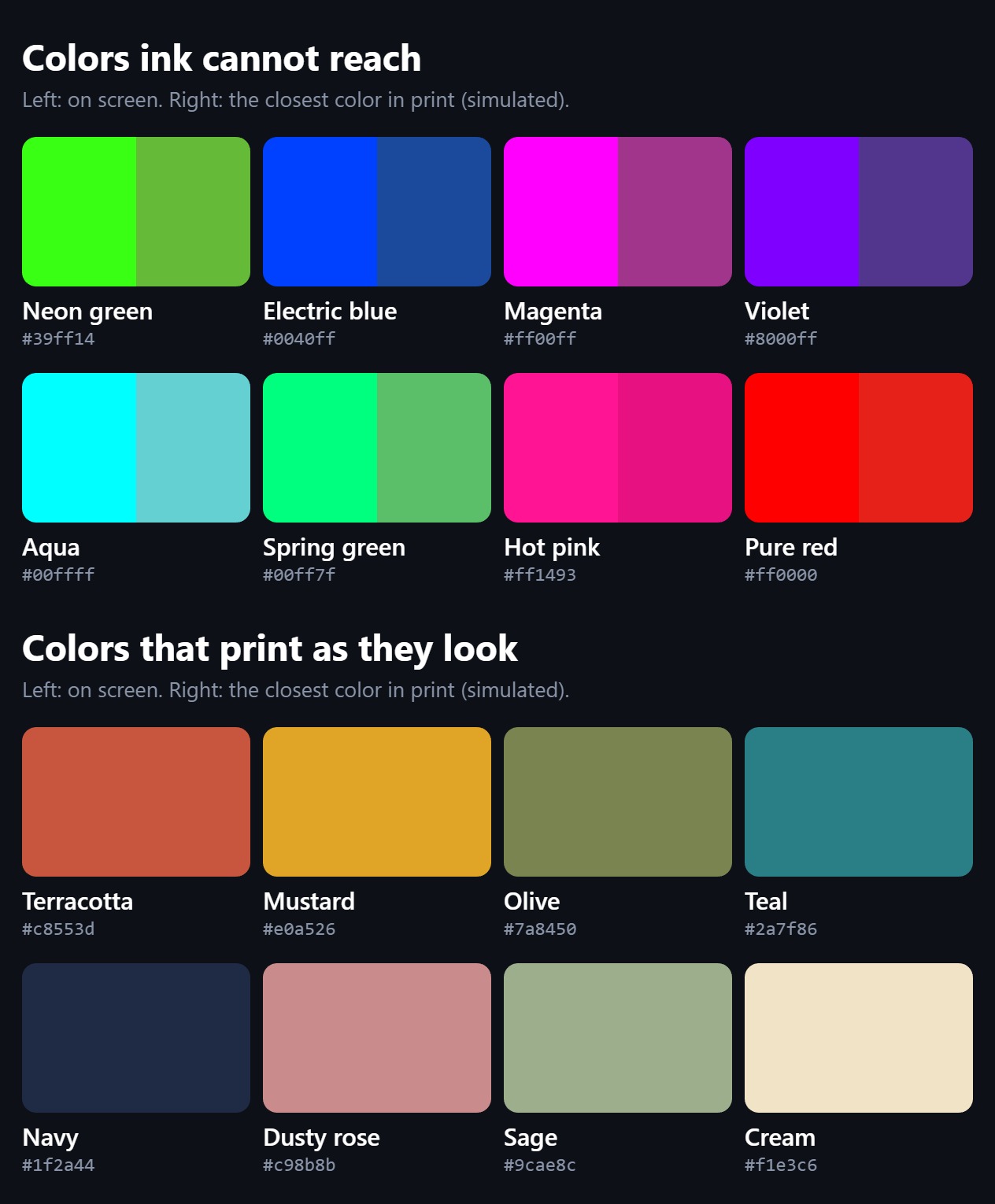
- Lost the most: neon and pure green, electric blue, magenta, violet and bright aqua. These can come back looking like a different, quieter color.
- Lost a little: pure red, hot pink and strong orange. They stay recognizably themselves, a shade flatter.
- Safe: earth tones, mustard and ochre, olive and sage, teal, navy, dusty pinks, cream, skin tones, grays, black and white.
A useful rule: if a color looks as though it is lit from inside, it is at risk. If you could mix it from paint, it is probably fine.
Why AI images are the worst case
A painting scanned from paper has, by definition, no color that pigment cannot make. A photograph of the real world has very few. AI images are different in three ways.
- They are made for screens. Image models learn from pictures published online and produce pictures in the same screen colors, with nothing holding them inside what a printer can do.
- The popular styles live at the edge. Synthwave, cyberpunk, vaporwave, neon signs, bioluminescence, “glowing” anything: the whole look is built from the colors in the top row of the chart above.
- Prompts push further out. Words such as “vibrant”, “vivid”, “neon” and “glowing” ask for more saturation, and the model obliges.
Glow is the hardest part. On a screen a glow works because the bright center really is brighter than everything around it. On paper the brightest thing available is the paper. A printed glow is only a pale patch, and it reads as a glow only if the rest of the picture is dark enough to make it look bright by comparison.
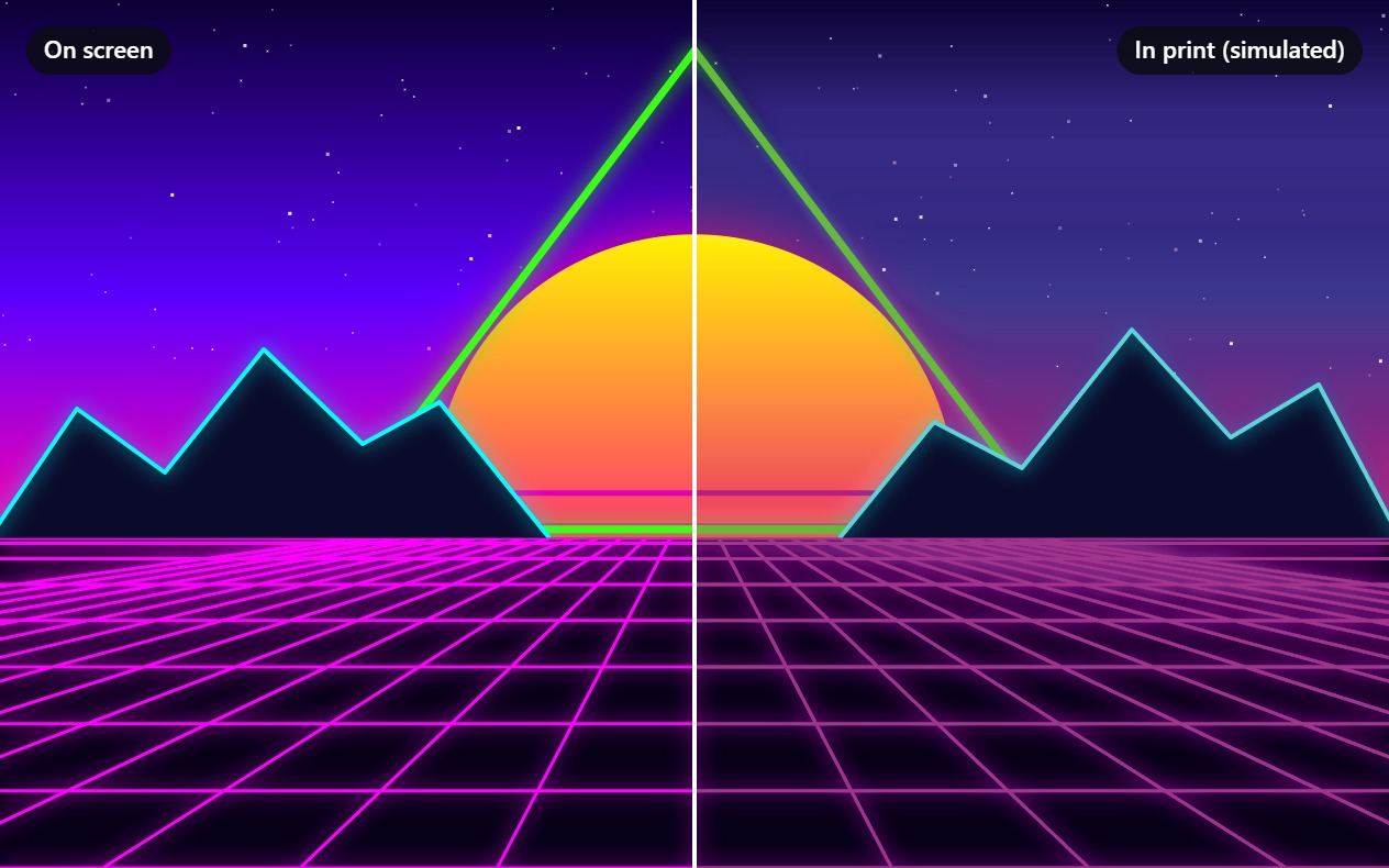
Check your image before you order
You cannot judge this by eye, because the screen you are looking at is the thing doing the flattering. The print color checker compares every pixel with what ink can reach. It is free, needs no account, and opens the picture in your browser without uploading it.
- 1Choose your imageAny PNG, JPG or WebP. It is checked on your own device in a second or two.
- 2Switch between “On screen” and “In print”Where nothing moves, the color prints as it looks. Where the picture goes flat, you are seeing the printer’s closest match.
- 3Tick “Show only what changes”Everything that prints faithfully is dimmed, and what is left is the part of the picture at risk.
- 4Read the color pairsEach pair is one of your colors and what it becomes, with the share of the picture it covers.
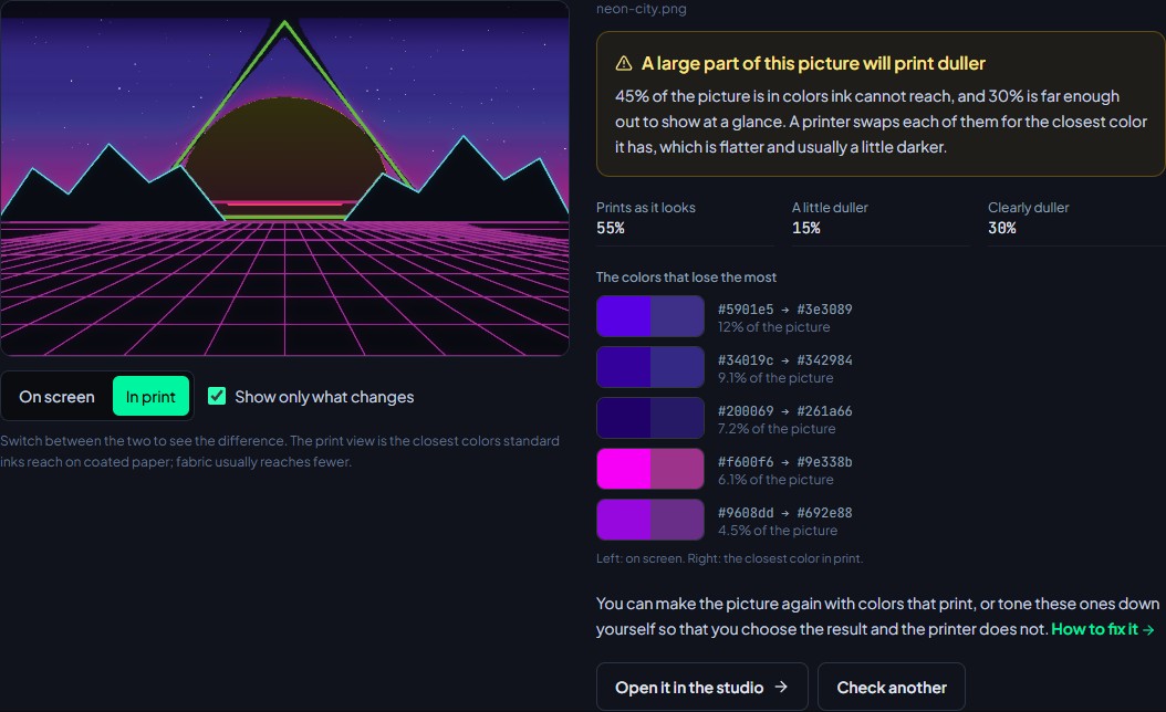
Then decide whether it matters. A few percent in small highlights will not be missed. When the marked part is the subject, the background or a logo, the print will look like a different picture, and it is worth fixing first.
Prompt for colors that print
The easiest fix is at the start. Styles that come from the history of printing carry their palette with them, because they were only ever made with ink.
- Name a print process: “screen print”, “risograph print”, “linocut”, “woodblock print”, “lithograph”, “vintage travel poster”.
- Name a paint: “gouache”, “watercolor”, “oil pastel”. A model imitating paint keeps to colors paint can make.
- Limit the palette: “limited palette of four colors”, “muted palette”, or the colors themselves: “terracotta, mustard, teal and cream”.
- Leave out the accelerants: “neon”, “glowing”, “vibrant”, “vivid”, “electric”, “luminous”.
The difference in a prompt is small. Instead of:
try:
You keep the tiger, the city and the mood. What you give up is a glow that was never going to reach the paper.
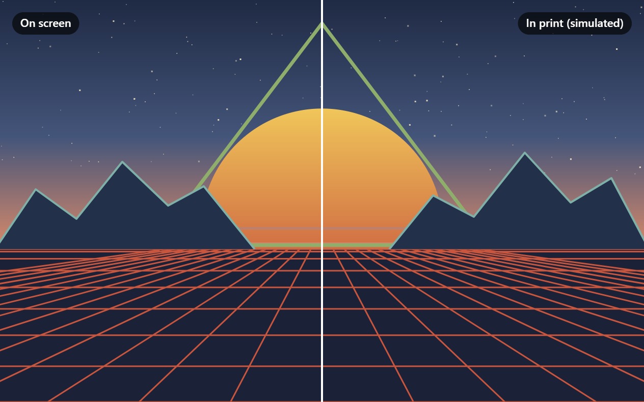
Fix an image you already have
If you love the picture as it is, tone it down yourself. That sounds like doing the printer's damage for it, and in a way it is, but with one large difference: you choose how it ends up. A printer treats each color on its own and has no idea which parts of the picture matter.
- 1Lower vibrance before saturationVibrance pulls back the most intense colors and leaves the quieter ones alone, which is exactly the job. In the SlapMake studio both are in the Adjust panel for an image layer.
- 2Check, and repeatDownload the result and put it through the checker again. Stop when the two views nearly match; there is no need to reach zero.
- 3Put the contrast back with light and darkA picture that has lost saturation can look flat. Deepen the darks and lift the lights instead: lightness prints faithfully where saturation does not.
- 4Keep glows against something darkA light shape on a near-black background still reads as glowing in print. The same shape on a mid-tone background does not.
Another route is to keep the composition and ask for new colors. In the studio, tap the picture, choose Edit with AI and describe the change: “same picture as a risograph print in teal, mustard and coral”.
Do not convert the file to CMYK yourself
Older printing advice says to convert artwork to CMYK before sending it. For print on demand that is the wrong move. Suppliers build their machines around ordinary screen-color files: Printful asks for files in the sRGB color profile and converts them on its own printers, and its help center warns that converting to CMYK first throws color information away and gives less accurate results.
So keep the file as it is, in sRGB, as a PNG or JPG. The job is not to change the file's format. It is to choose colors that survive the trip. For more on the two color systems, see RGB vs CMYK for print on demand.
The product changes the answer
- Glossy and coated paper holds the most color. A glossy poster is the closest a print gets to the screen.
- Matte paper and canvas soak up more ink and look a little softer, as on a matte poster.
- Fabric reaches the fewest colors. Cotton absorbs ink and its weave scatters light, so a shirt is always quieter than a poster of the same file.
- Dark garments are printed on a layer of white ink first. That keeps colors from sinking into the fabric, but they are still ink colors, not screen colors.
Whatever the product, the only exact answer is a real one. Order a single copy before you order twenty or list it for sale. Print on demand has no minimum, so one is a normal order.
Before you press order
- Color: run the image through the print color checker.
- Size: make sure it has enough pixels with the print size calculator.
- Background: for shirts and stickers, look for leftovers with the transparent PNG checker.
- One first: order a single copy and look at it in daylight.
None of this means AI art prints badly. It prints as well as anything else once its colors are ones a printer owns. The pictures that disappoint are the ones that depended on being lit from behind.
Questions people ask
Why does my AI art look dull when it is printed?
A screen makes color with light, and ink can only absorb light from white paper or fabric. The brightest, purest screen colors, which neon and glowing AI images are full of, have no matching ink. A printer replaces each with the closest color it has, which is flatter and usually a little darker.
Can neon colors be printed?
Not with standard inks. Neon green, electric blue, magenta and bright violet are outside what cyan, magenta, yellow and black can mix. They print as quieter versions of themselves. True neon needs special fluorescent inks, which ordinary print-on-demand products do not use.
How can I see how my image will print?
Put it through the SlapMake print color checker. It shows the picture as standard inks would manage it, marks the areas that change and lists the colors that lose the most. It is free and the image is not uploaded. For an exact answer, order one copy before ordering more.
Should I convert my design to CMYK for print on demand?
No. Print-on-demand suppliers such as Printful ask for files in the sRGB color profile and convert them on their own printers. Converting to CMYK first discards color information and tends to give a less accurate print.
What should I put in a prompt so the colors print well?
Name a style that comes from print or paint, such as screen print, risograph, linocut or gouache, and ask for a limited or muted palette, or name the colors. Leave out neon, glowing, vibrant and electric.